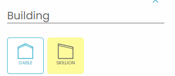
Below is the list of UI Items that can be changed for your Quotec Now. This list tells you what each item will change on the designer and by clicking on the expanders under each item you will be able to see online designer images clearly showing what is affected. The examples use unlikely colours simply to show the areas impacted. Use good design skills to set the colours appropriately.
If you are looking for a specific UI Item click the name on the right to jump to it.
Font Name
Sets the overall font of used within the system. Adjust the font by inputting the name of any https://fonts.google.com/.
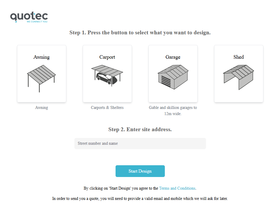
See an example of the font set to Times Roman.
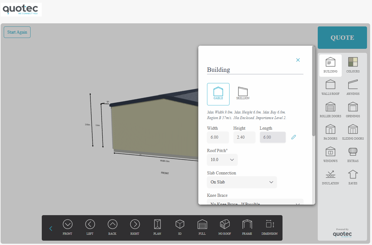
Font Color
Adjust the colour of the main font.
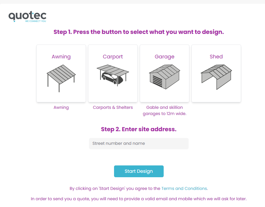
See an example of colour set to purple.
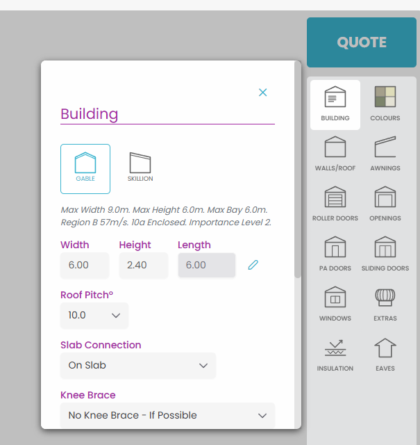
Lightest Grey
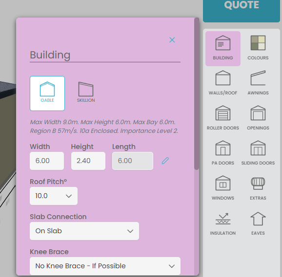
The colour used for the background of slide out panels.
See an example of the colour set to pink.
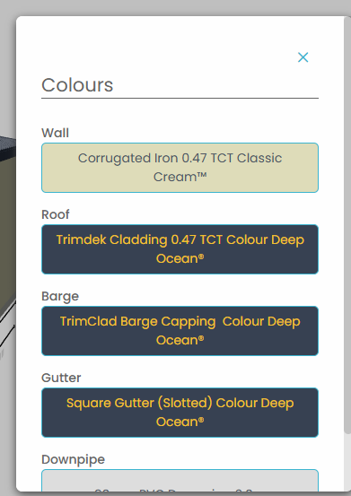
Mid Grey
The colour of button text if the system determines the text colour would otherwise be too dark for the button background colour.
See an example of the colour set to yellow.
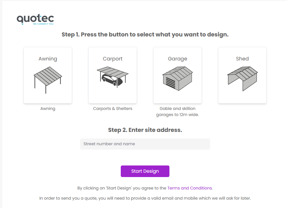
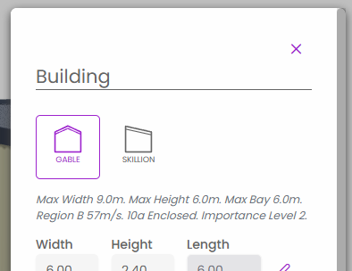
Primary Colour
The main colour on buttons and hyperlink text, input. This is usually set to match the main company’s branding colour.
See an example of the colour set to purple.
Primary Btn Foreground Colour
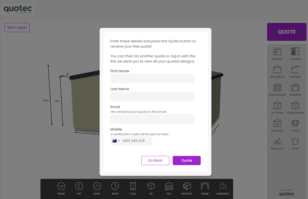
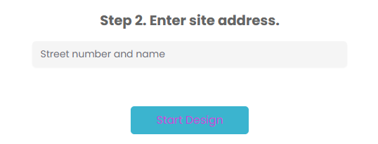
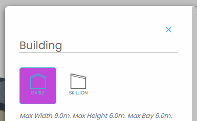
The colour to use for the text of a button which is primary colour. It the button is an outline button in the slideout panels (using the primary colour), the background of the button will be this colour.
See an example of the colour set to purple.
View Bar Background
The colour of the bar where the view buttons appear. These are the buttons that allow you to change the current view of the job - frame, roof only, full, etc.
See an example of the colour set to purple.
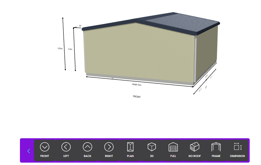
To make a seamless view bar match this to your View Bar Btn Background
View Bar Btn Foreground Colour
The colour of the icon/text on an View Bar button. Some icon sets will only change the colour of the text.
See an example of the colour set to yellow.

View Bar Btn Foreground Colour Hover
The icon/text colour of a View Bar button when the user hovers over it.
See an example of the colour set to yellow.

View Bar Btn Background
The colour of the background of the View Bar buttons.
See an example of the colour set to yellow.

To make a seamless view bar match this to your View Bar Background
View Bar Btn Background Hover
The background colour of a View Bar button when the user hovers over it.
See an example of the colour set to yellow.

Action Bar Background
The colour of the background of the Action Bar,
See an example of the colour set to yellow.
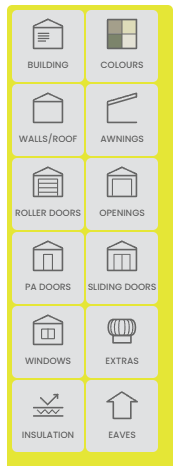
Match this to your Action Bar Btn Background for a seamless design
Action Bar Btn Foreground Colour
The colour of the icon/text on an Action Bar button. Some icon sets will only change the colour of the text.
See an example of the colour set to purple.
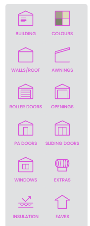
Action Bar Btn Foreground Colour Hover
The colour of the icon/text on an Action Bar button when the user hovers over it.
See an example of the colour set to purple.
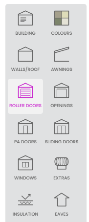
Action Bar Btn Background
The background colour of an Action Bar button.
See an example of the colour set to yellow.
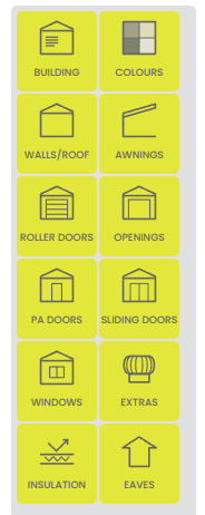
Match this to your Action Bar Background for a seamless design
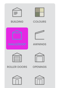
Action Bar Btn Background Hover
The background colour of an Action Bar button when the user hovers over the button.
See an example of the colour set to pink.
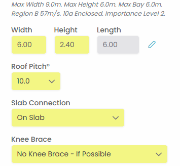
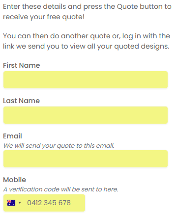
Input Background
The background colour of an input control.
See an example of the colour set to yellow.
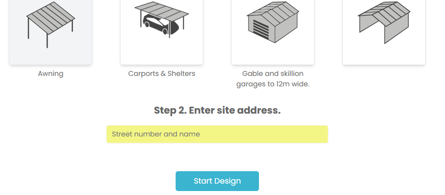
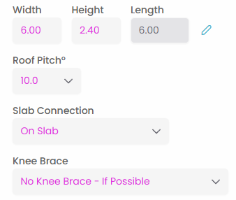
Input Text Colour
The colour of the text in an input control.
See an example of the colour set to pink.
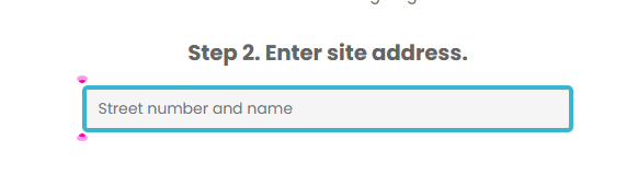
Input Border Size
The size of the border of an input control. By default the border colour is the same as the background so you may only notice this on hover or focus, or if you change the input border colour.
See an example of this set to 4px.
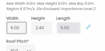
Input Border Colour
The colour of the border of an input control.
See an example of the colour set to pink.
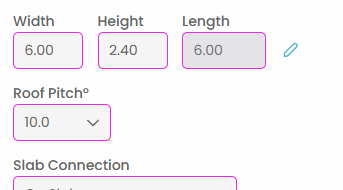
Input Border Colour Hover
The colour of the input control border when the user hovers over it.
See an example of the colour set to pink.
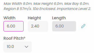
Input Border Colour Focus
The colour of the input control border when it has focus.
See an example of the colour set to pink.
Icon Btn Foreground Colour
The foreground colour of a non-primary icon button.
See an example of this colour set to green.
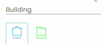
Icon Btn Foreground Colour Hover
The foreground colour of a non-primary icon button when the user hovers over it.
See an example of this colour set to brown.
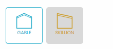
Icon Btn Background Colour
The background colour of a non-primary icon button.
See an example of the colour set to yellow
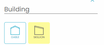
Icon Btn Background Colour Hover
The background colour of a non-primary icon button when the user hovers over it.
See an example of the colour set to yellow.